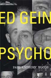
 This book is about the serial killer Ed Gein, his life and crimes, including a lot of pictures.
Thursday, April 23, 2009
Thursday, April 9, 2009
Tuesday, April 7, 2009
Fixing an Ad
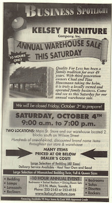 This ad isn’t effective because it is too cluttered. There are three or four points of emphasis and several different fonts, which make it hard to read.
Kelsey Furniture Company, Inc. is located in Tuscola, Illinois. It has been in business for over 49 years and by the same family. Third generation owners, Chad and Tina Hausmann, currently own it. It is a locally owned family business, with two locations in Tuscola. They have over 30,000 sq. ft., of brand name furniture, carpeting and bedding. Its competition is Midwest Galleries, Amish Country Heirlooms, Homestead Furniture, and Das Holz Haus. These are all furniture stores in Tuscola, there are many more in surrounding towns as well.
 I think this ad is good because the contrast in the picture makes it very clear even though it is in black and white. It also flows well and doesn’t have too much information that you are overloaded.
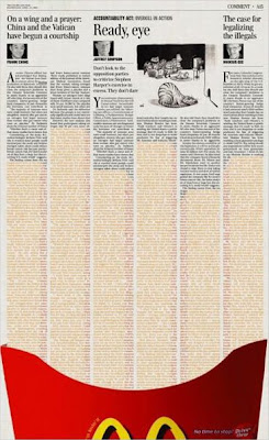 I like this ad because although it doesn’t even say the entire name of the company you know what it’s for. It is simple but effective.
 This ad is effective because it is very uniform with one large image and caption to attract your attention. It is very simple and clear and gets the point across.
Thursday, April 2, 2009
QUESTIONS
1. Figure/ground tension adds visual energy to an image or mark; it can shift its direction and impact on the viewer.
2. Reversible figure/ground is when the positive and negative elements attract attention equally and alternately. They come forward and recede as your eye perceives it. It is often seen in ceramics, weaving, and crafts.
3. A frame sets a work apart from its surroundings and brings attention to it apart from its setting.
4. Hierarchy controls the delivery and impact of a message, without it a composition is dull and difficult to navigate.
Tuesday, March 10, 2009
BaLaNcE
There are two main kinds of balance, symmetrical and asymmetrical. Symmetrical means that everything is the same on either side of a dividing line (like a butterfly.) Asymmetrical is when things are not the same (when things do not qualify as symmetrical.) There are different ways to make things asymmetrical, such as shape, size, and color.
 This shows symmetry because there is a dividing line and everything on either side is a mirror image of the other side.
 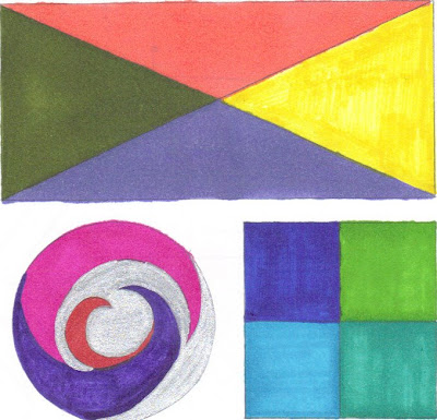 This shows asymmetry with shape, size, and color. The much larger box throws off the balance as does the single circle. The different colors also make the balance not symmetrical.
  This is another example of asymmetry because of the sizing of the letters, as well at the changes in color. The different shapes of the letters makes it not symmetrical as well.
 Tuesday, February 17, 2009
empHAsis
 This ad shows emphasis with size, there is the repeated image of a volleyball, but the one in the front is much larger than the rest drawing your eye to the text on it.
  The emphasis on this ad is on the mascara in the center of the page. It is very eye catching because of the color. The bright pink on a solid black background draws your eye to the mascara they are selling.
 This ad shows emphasis by direction the black on orange draws your eye to the center of the page, and the line down the center directs your eye to the photo and Active Ankle symbol.
Saturday, January 31, 2009
Planes, Lines, and Points

A plane is a flat surface extending in height and width, a line with breadth. This ad shows plane with the design on the words “To sing your song you gotta have lips!” The solid blue receding into space shows all the planes of the type.

A line is an infinite series of points, a connection between two points, or the path of a moving point. This ad first shows line in the purple shapes that are created with flowing lines with different widths and curves. Secondly there is implied line on the right side of the ad with the text. The edge of a column is implied by the even ending points of successive lines of type.

A point marks a position in space, a pair of X and Y coordinates, graphically taking the form of a dot. This ad clearly shows the graphic form of a point, with many different shades of blue dots all around to form emphasis on the phones that are for sale.


